“Jesus is the Way!” This is certainly a common saying among Christian evangelicals. And, for good reason (ref. John 14:6).
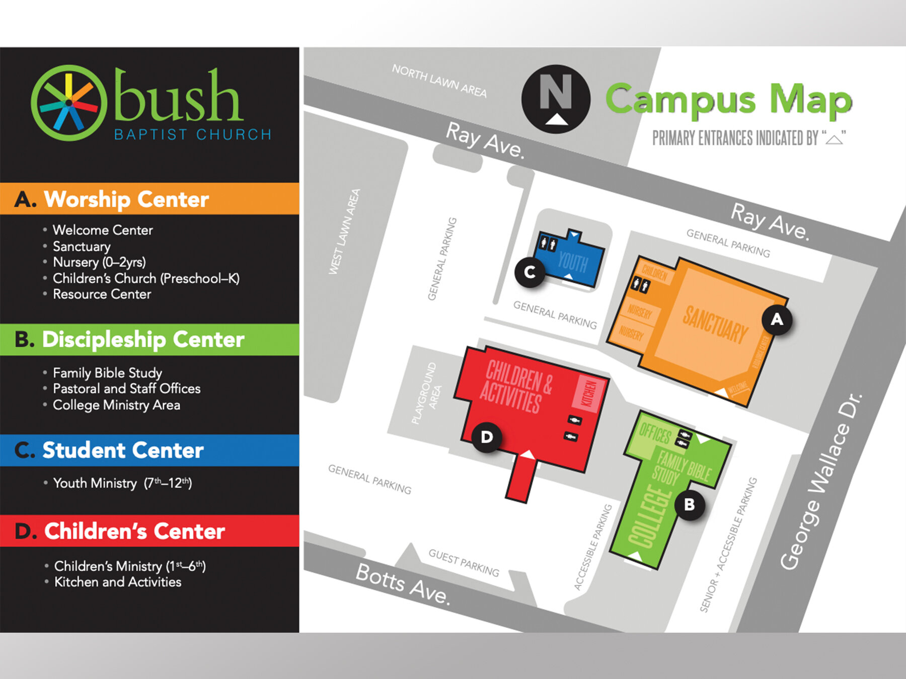
But, what if you were simply trying to find your way in, around, and through a church campus—one that has been progressively modified and added to multiple times over generations? More than likely, there was no master plan generated by knowledgeable architects who fully considered the repurposing of buildings, the addition of new structures, the expansion of parking spaces with loading and unloading zones, new ministries, and so much more. Since God is not the “author of confusion” it seems only fair to consider Wayfinding important on several levels and not just for the biggie—eternal salvation.
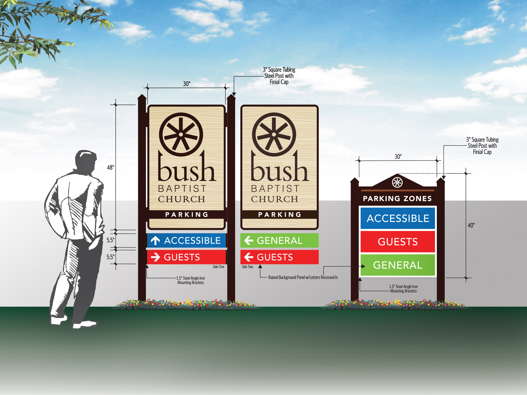
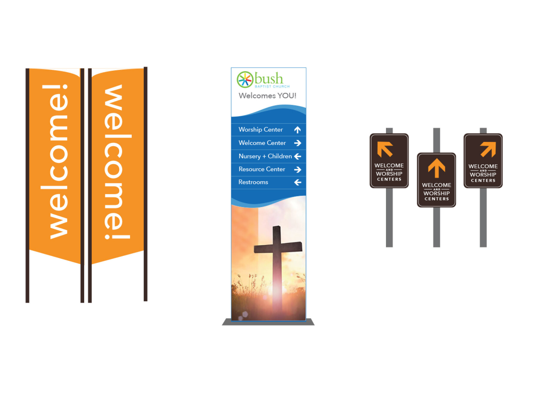
This was the production teams’ visual concept of the primary identity sign.
So, how does someone new to the church campus navigate through the various unfamiliar and often times disjointed structures and thoroughfares? Enter, the Bush Baptist Church Design Team of which I am thrilled to be a part of. We were charged by our pastor—Dustin Coleman—to consider all possibilities in making our church campus more navigable. Also, a shout out to Jeff Ryan of Blockwire Manufacturing for his huge part in fabrication!
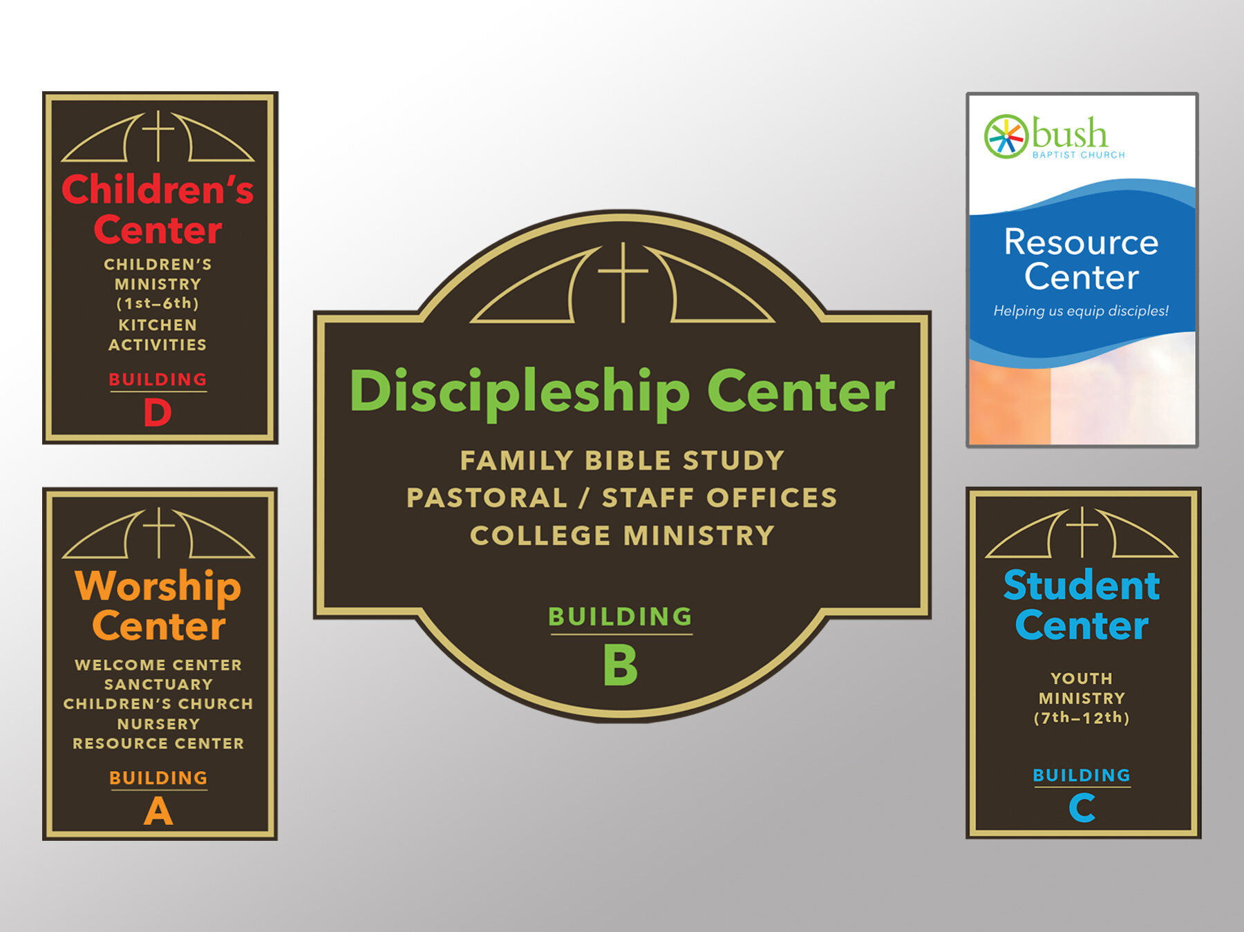
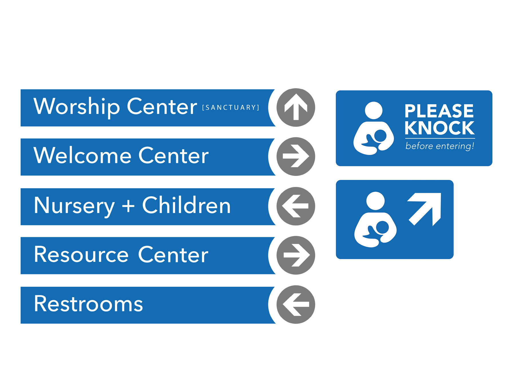
The Bush Design Team spent many weeks studying the possibilities by researching “wayfinding” in general as well as the needs of our guests and members. We determined to start with three types of signage—1) Identity Signage; 2) Informational Signage; and 3) Directional Signage. We literally went through scores and scores of iterations to arrive where we are now. The Design Team currently consists of designers—Shamario Ross, Cassandra Brent, Aaron Johnson, Aaron Wilson, and yours truly. The entire church staff (Dustin Coleman, Marlon Woods, and Nikki Hensley), as well as Mike Davis, were valuable contributors to this continuing process.
This was the vertical version of the Bush logo as created by Clay McCullough.
The primary element of identity signage is certainly the logo. In 2017, Bush’s Design Team also went through the process of developing a meaningful logo for what was then known as Bush Memorial Baptist Church. It was determined to delete the “memorial” word from the naming as it sounded a little “funerary”. The Bush family was considered and consulted as not to offend. In fact, they were thrilled with the idea of deleting “memorial” from the church’s name.
The logo was designed by then student-designer and member of Bush—Clay McCullough.
In The Calvary Road, author Roy Hession compares the local church to a “wheel”. This symbol strongly characterizes the importance of horizontal and vertical relationships within the Body of Christ with the members being like spokes and Jesus being the critical center of our existence. The closer we get to Jesus Christ, the closer we get to one another.
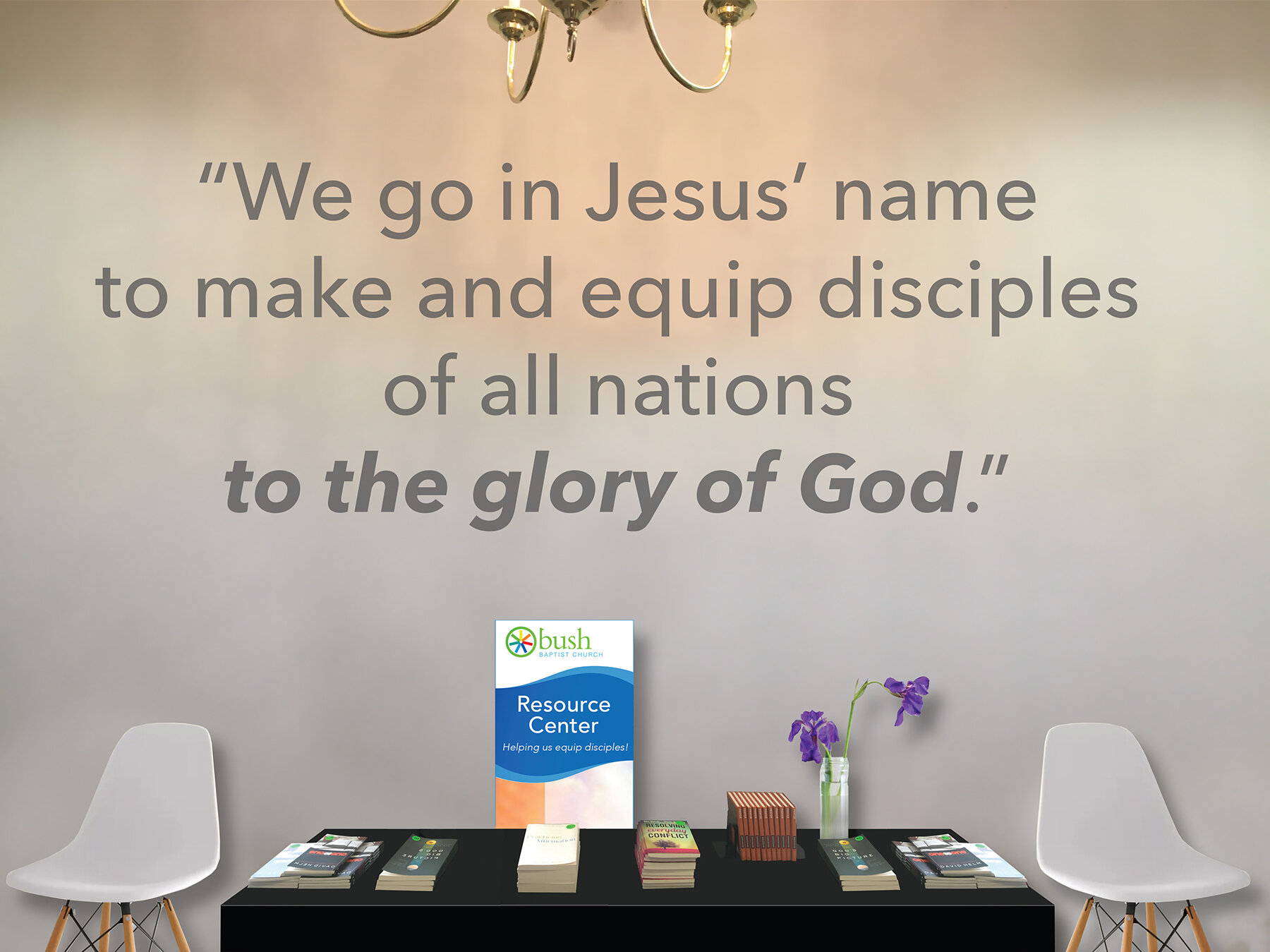
As you can see from the few images below, the team has made progress with a little more to do to make good on our charge. Onward and hope You find THE WAY!!!
“I am the way, and the truth, and the life. No one comes to the Father except through me. —John 14:6”


